Danielle
Pasco
Collection Database - 101+ Words That People Used To Describe Dani
Back in senior year of high school, my teacher gave us an assignment. It was to ask 50 people what one word they would describe me as. My teacher was expecting a lot of the same words to be used over and over, but my collection of words turned out to be quite the dictionary of quirky and esoteric words. I kept this memory in mind when I was thinking of a collection to turn into a database. I chose this theme, and ran with it. Below I will show you the process I took to create this very personal database of mine.
We were to create a database with 7 different types of data, all communicating a similar idea. Then we used that data in a very detailed infographic-like design that visually showed all of that information in a way that was easy to understand and easy to sort through. After the static design was created, we had to create an interactive way to search for specific information in our database, then show that interactivity through motion design.
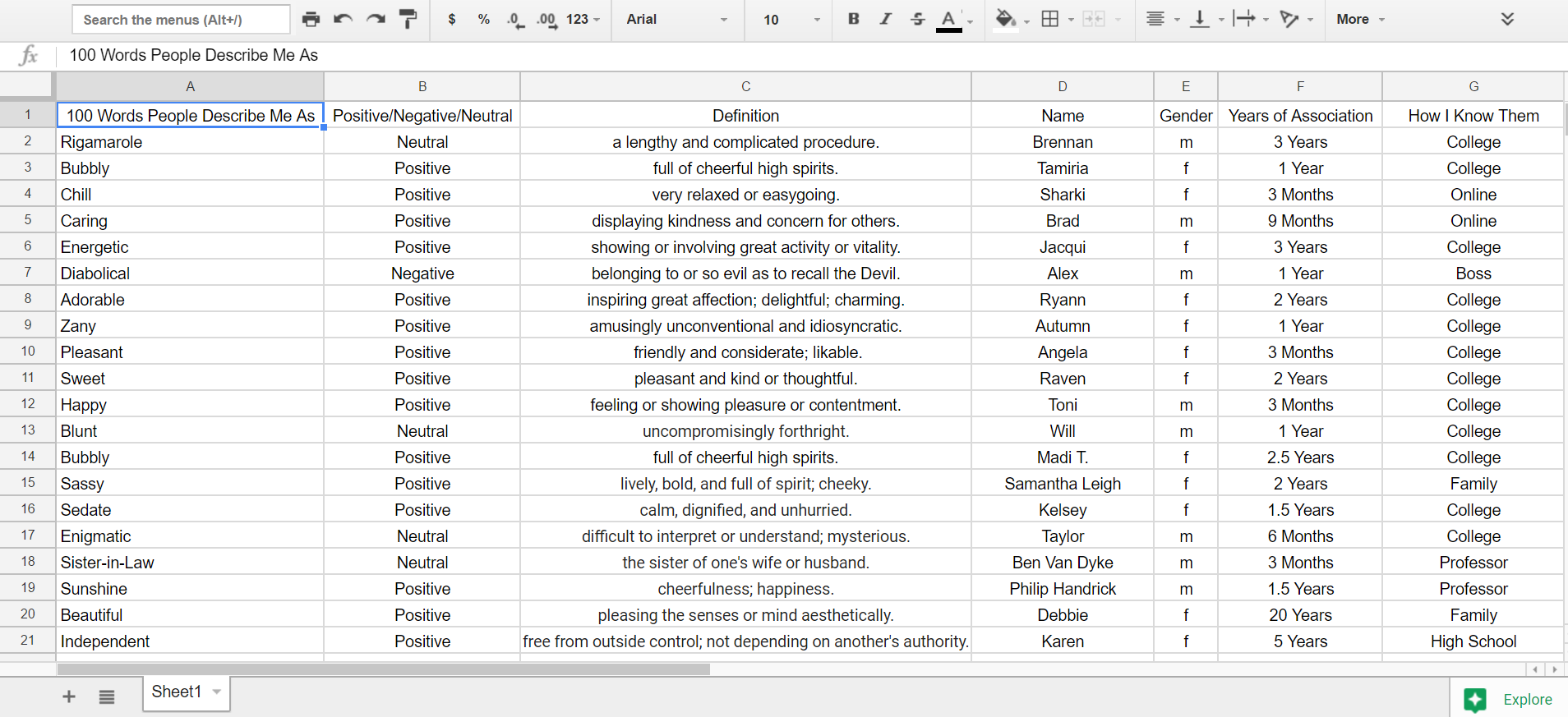
Excel Sheet
After many different decisions about which data points to use as my seven categories of information, I decided on: Word, like/dislike/nuetral, definition, name, gender, how long I've known the person, and how I know the person. This shows a lot about the person who said the word, and might show patterns in what kind of people call me certain words that are different than another group of people. I collected the data in this excel sheet for easier organizing.

First Digital Sketch
This was my first digital sketch of my database. Originally, I was going to have each person's name jut out from the side of the word bubbles towards the center. However, there were just too many words jammed in the college columns to be able to do this effectively. There were too many words to be able to do this effectively. But instead of having the names jut out, I changed the design so that the names would wrap around the bubbles entirely. This way, the bubbles naturally got bigger as names were added to it, instead of artificially, as I did here. The dislike and like functions also were not working well, as the top symbol looks more like the red cross symbol.

Final Static Collection Database
The final design looks much more coherent than the previous design. Every data point is organized and partnered with other data points that are represented by the key, and it is visually appealing to look at. The like and dislike symbols were shown just by turning the innter bodies of the bubbles the corresponding color of blue for like, yellow for neutral, and red for dislike. The bright, pastel colors match up with each other well and the viwer can tell exactly which word was used the most to describe me.


Interactive Database Wireframes
Now that the static visual design is complete, it's time to figure out how to make it searchable and interactive! In my wireframes, I tell how I want the bubbles to move and what will be added to the existing design to make it easier to navigate. I used a wheel in the top right corner that serves as a search function that gets more defined the more specific data points you enter in.
Final Interactive Video
This is the video of how the interactive database would function. With all 7 of the data bubbles being able to be selected and refined, a user can find any data point within the vast collection. If they are so inclined, they can even add their own entry to the database. It is as simple as it is complex; simple to use, but can be a very complex system if a user is trying to find a very specific set of combinations.