Danielle
Pasco
Fenner Nature Center Website Re-design

For this project, I was tasked with re-designing the Fenner Nature Center website, which needed some real revamping. Using the established branding that Fenner already had in place, I created a new design for their website that is much more functional and well-organized than before. The project was broken down into 4 parts:
- Research the physical and online space.
- Identify the visitors of the space and what information they need.
- Plan a path for a user, keeping in mind their goals and motivation.
- Design the website.
For the first few parts, I worked with a group of 3 people to develop the information and organization the website neededI will take you through the steps I took to creating a new website for Fenner Nature Center below.
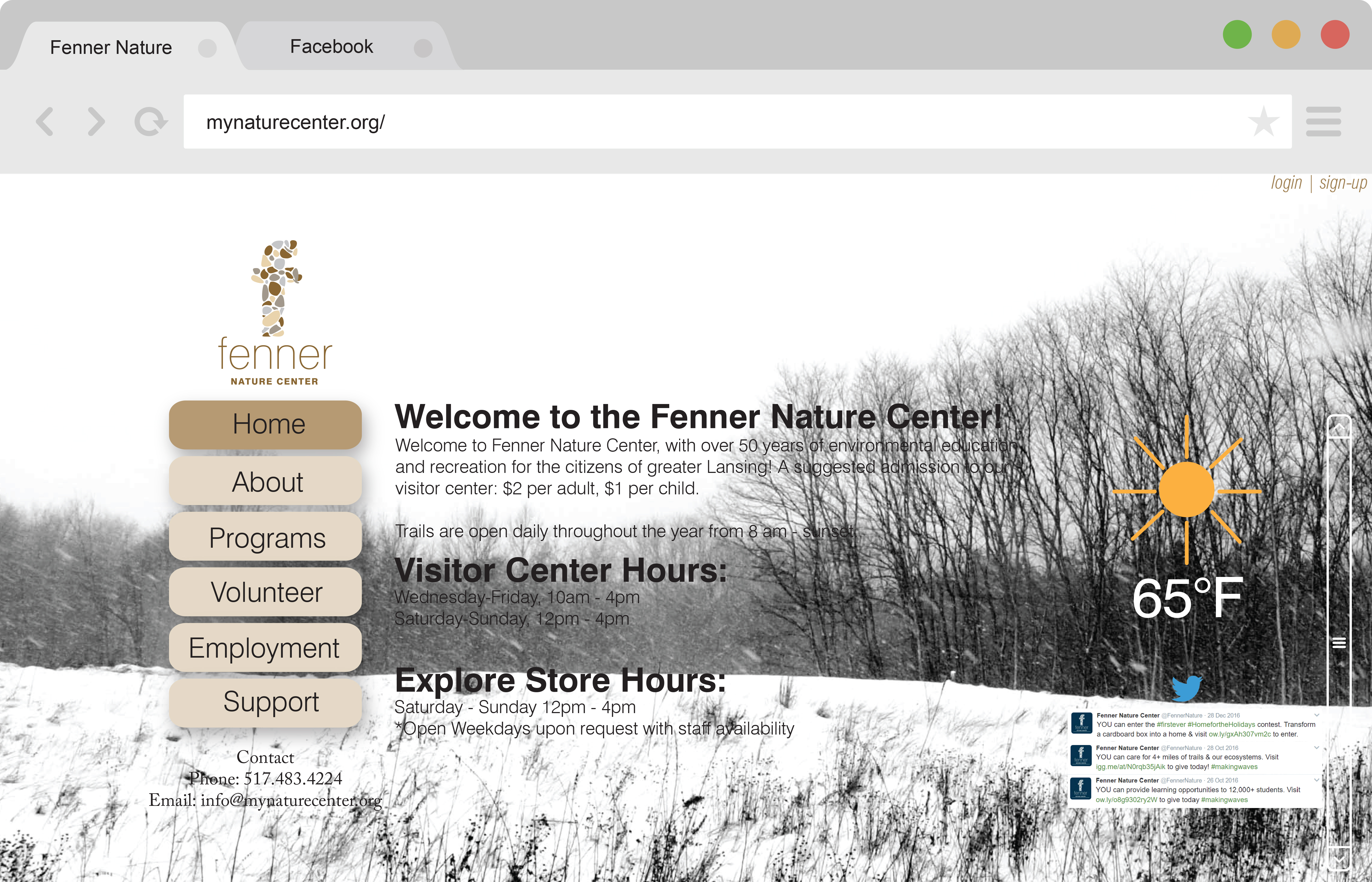
The original Fenner Nature Website badly needed a new design.

Landscape Analysis
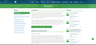
After researching the Fenner Nature Center in person and thoroughly browsing through their website, I was officially ready to start the project. I started off creating a Landscape Analyses, which is comparing the website I am going to re-design to other websites, and spotting the strengths and weaknesses of them all. From there, I can determine how best to re-design the website and have it function better. I chose the Belle Isle Conservancy and Indian Springs Metropark as my websites to compare to Fenner. Both are far more appealing design-wise than Fenner, and both are better organized.

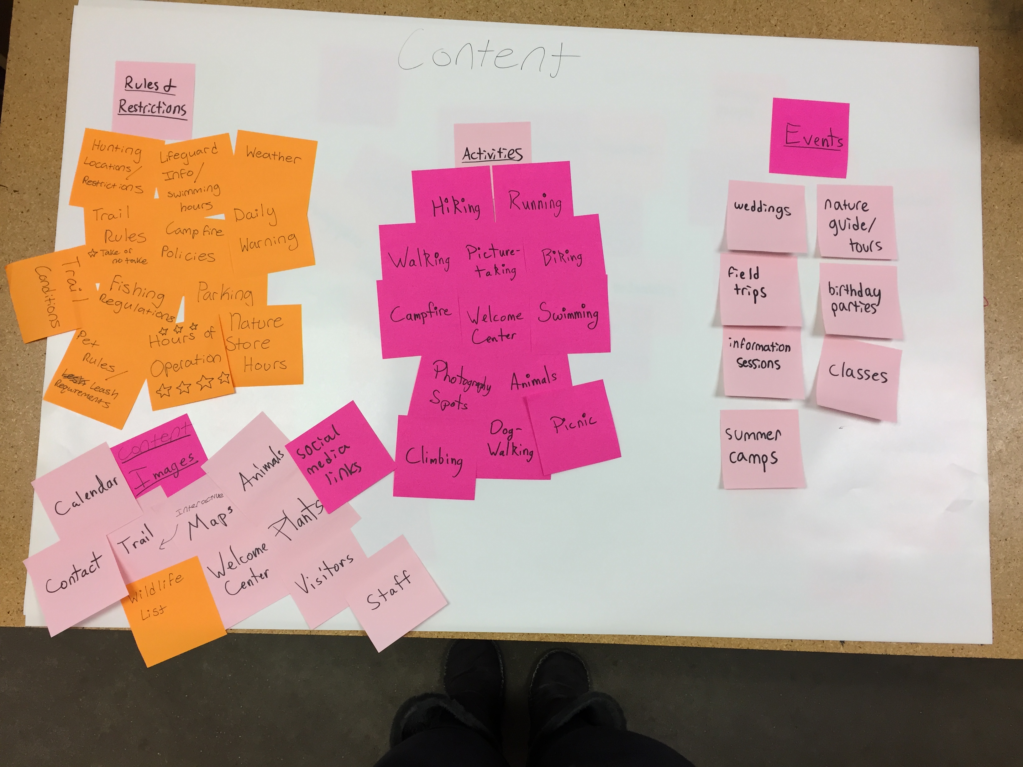
Content Diagrams
My group and I created what is called content diagrams, which are diagrams mapping out how information should be organized. We created the first diagram with sticky notes, then using that we created the digital diagram. We separated the information into four distinct categories: Rules and Regulations, Activities, Events, and Images.
.jpeg)

Audience Diagrams
Audience diagrams are similar to content diagrams, except people and visitors to the center are what is mapped. We wrote down all the visitors that may visit the center, and then organized them into groups determined by why they were visiting.
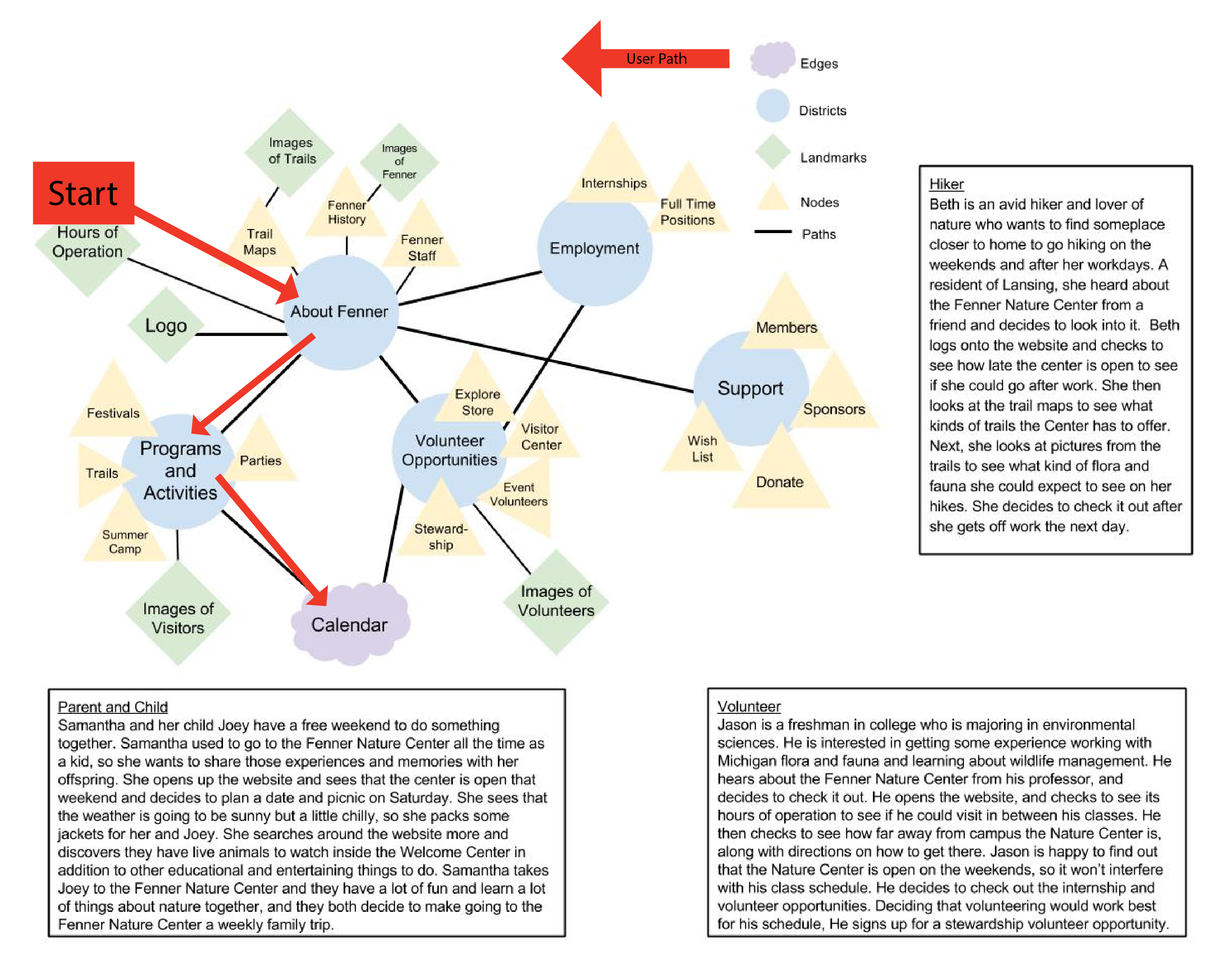
Lynch Map and User Paths
My group, after creating the audience and content diagrams, wrote user paths that explained how a potential visitor might browse through the website, looking for specific information.
My user path told the story of Samantha looking for something her and her son can do for fun at the Fenner Nature Center, and I created a lynch map showing exactly what paths she would take to get the information she needs.
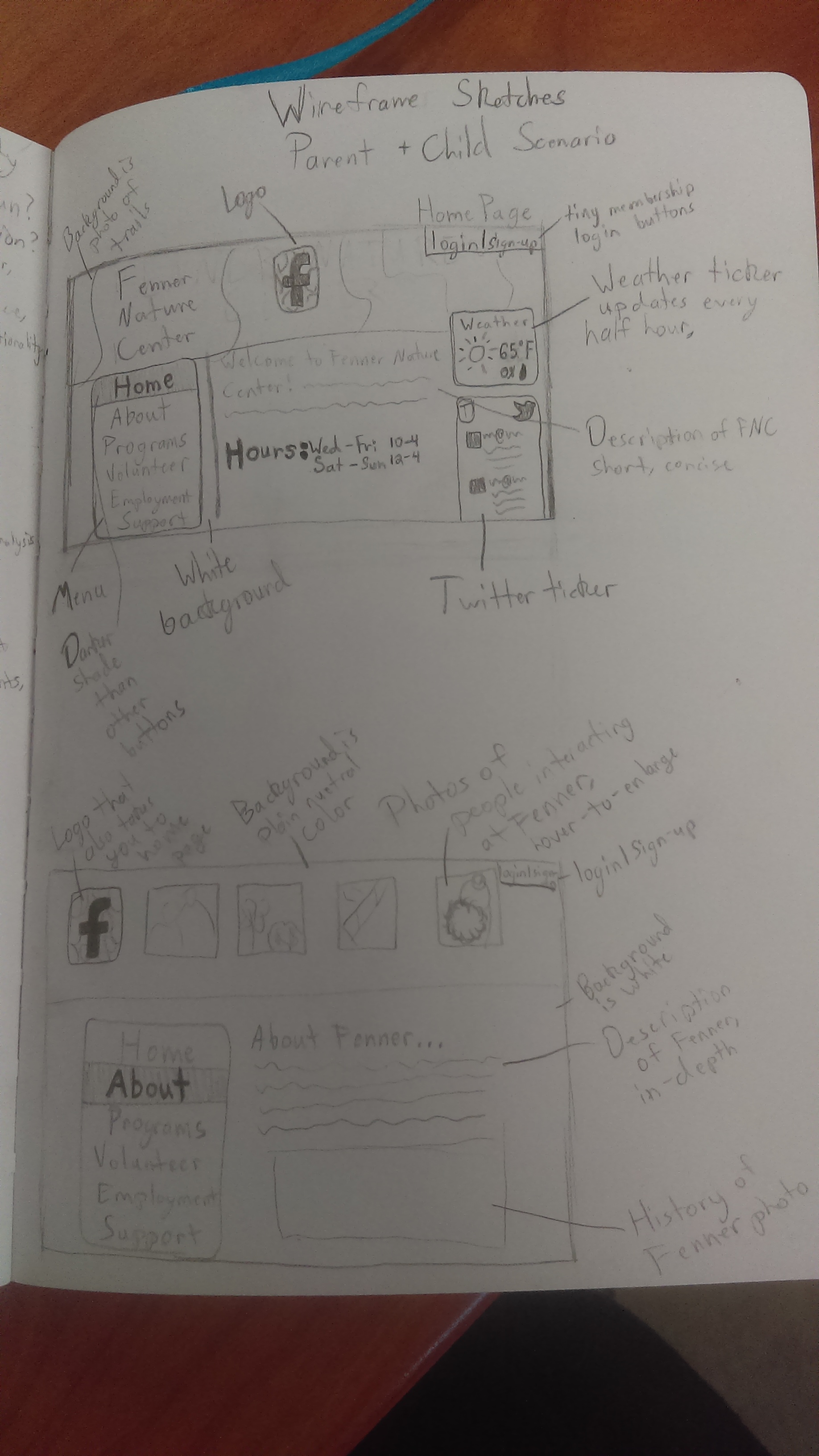
Analog Sketching
This is the first stage where we break from the group and start designing on our own. I created very messy sketches to be able to get all my ideas out onto paper, as it is the best thing to do before designing anything. This is one of my bare-bones early sketches.
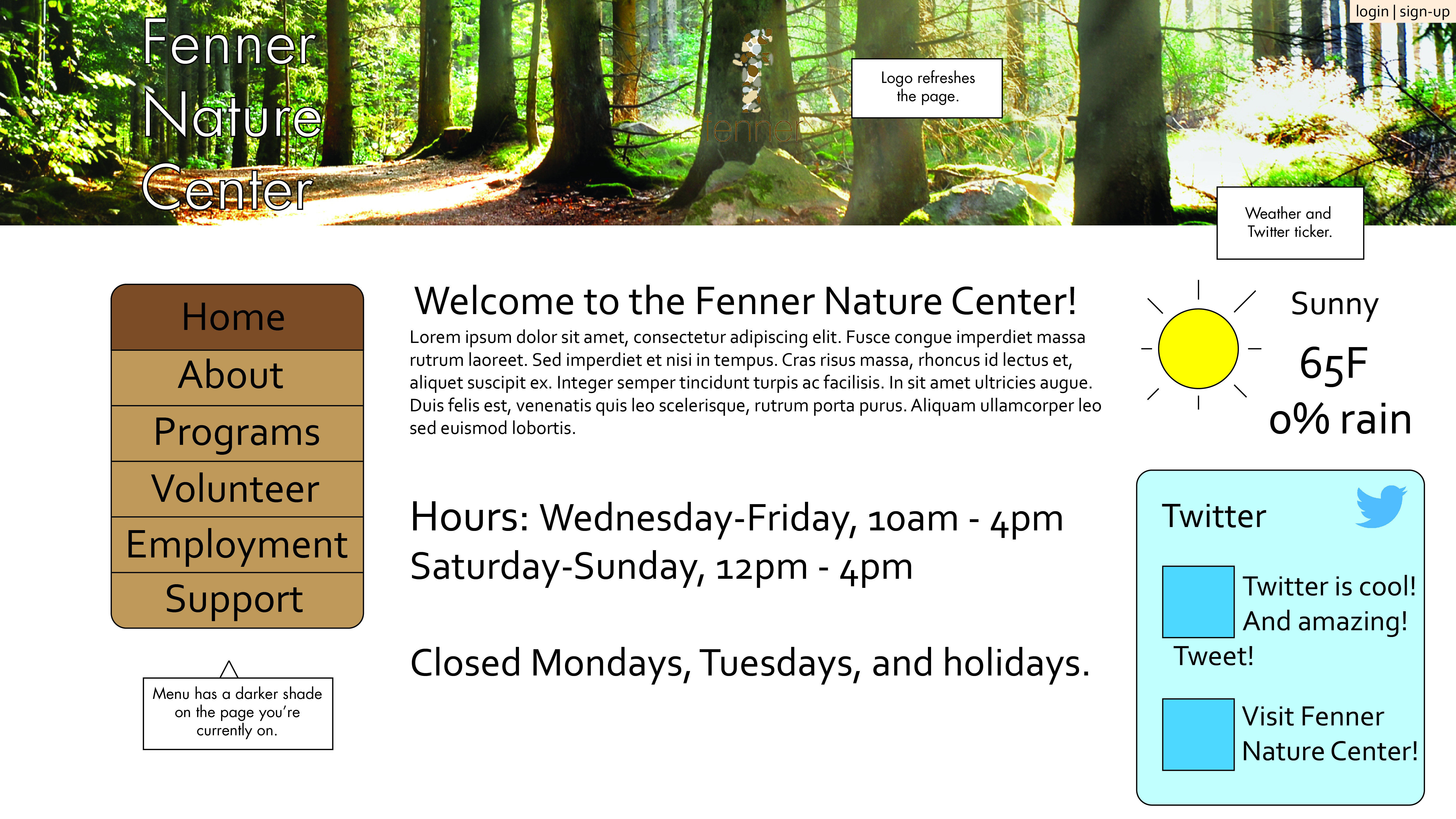
Low-Content Wireframes
Low content wireframes are used to create very simple graphics to show somewhat how the website is going to look and function. This is an a blueprint for the design, and is not very detailed, so that changes can easily be made. Minimal design elements are used for sake of ease, and most of the images are stock and text is placeholder for the time being. Basic functionality is shown here, along with what tools should be present on each screen. UX design tools are used for low content wireframes as minimal placeholders until the layout is ready and the design can move forward onto the next steps.
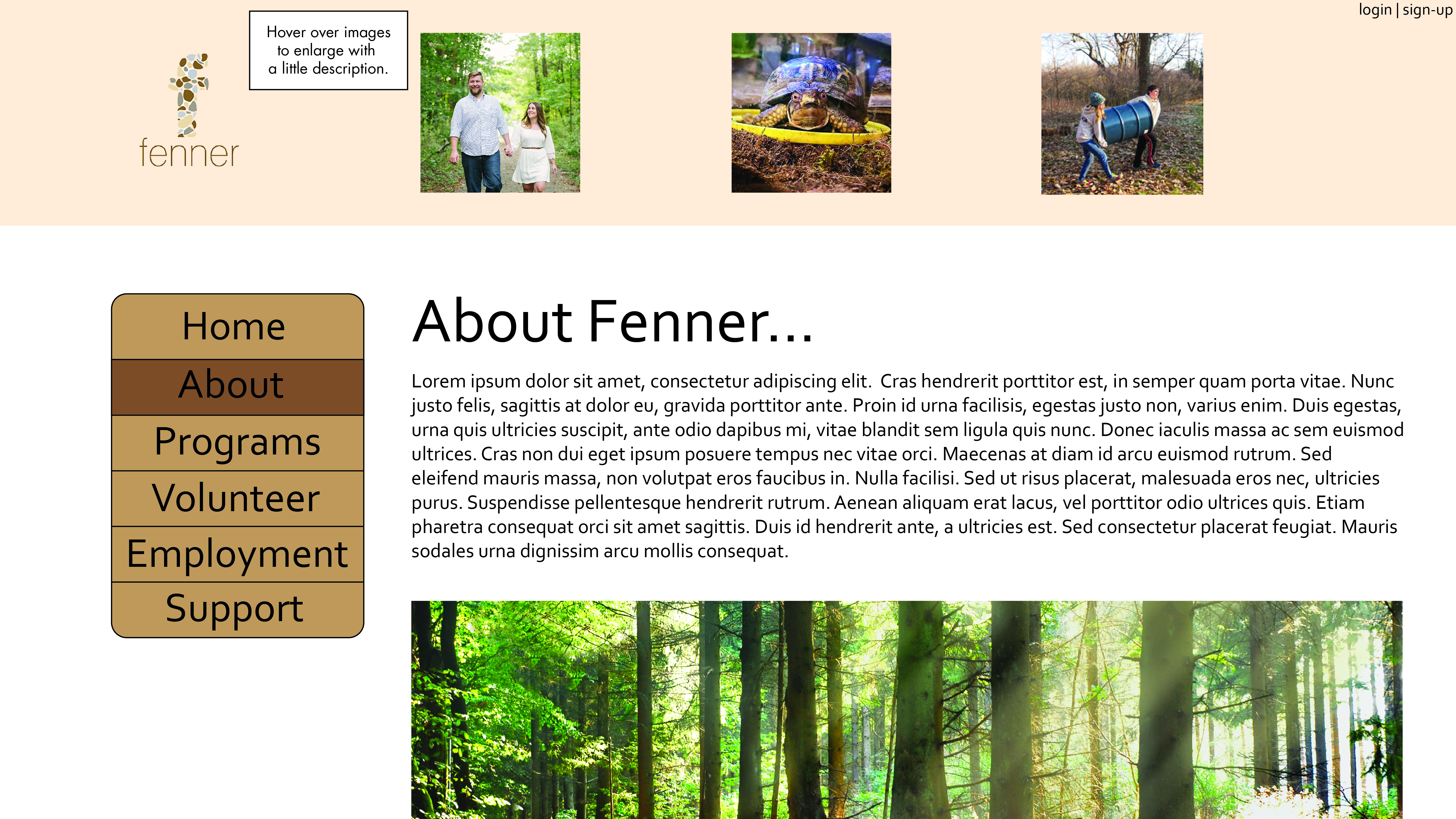
High-Content Wireframes
High-content wireframes are essentially the same as the low-content, except with more detail and notes to describe exactly how things work. The organization of the website is fine-tuned, the layout is adjusted if need be, and more design elements are introduced. Real text is put into the high-content wireframes to get it closer to the real website design, and everything is a little bit more refined. After this stage of wireframes is approved, I start on the visual design of the Fenner Nature Center Website.
Process Designs
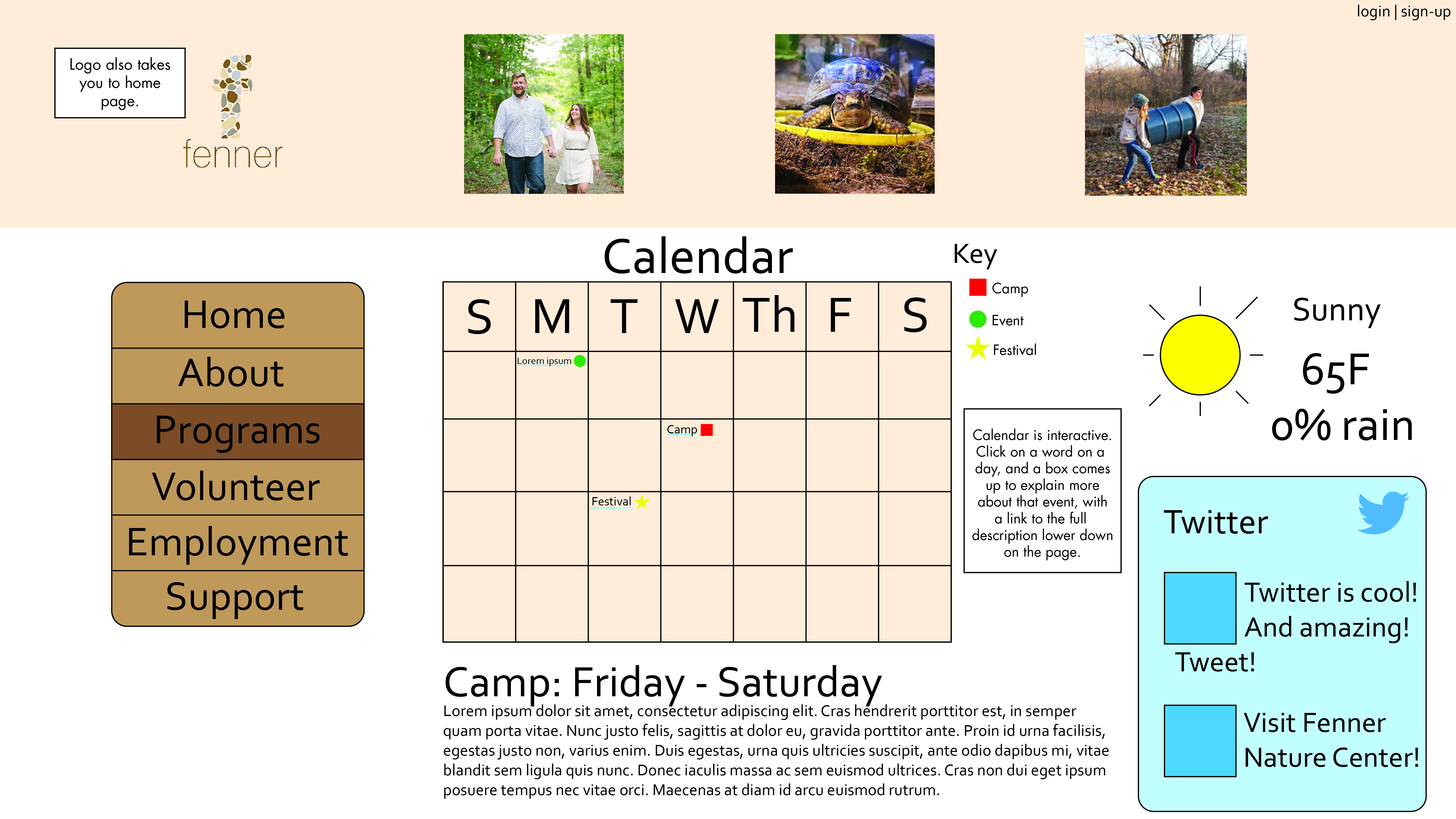
These are some of my process designs that were a quite a few changes away from the final design. I had trouble with integrating the calendar with the gallery images on the second page, however I solved the problem by having the images show pictures from the event that the user clicks on in the calendar. The very nuetral color pallete of the Fenner website needed a splash of color, so I added green to some ares of the website.

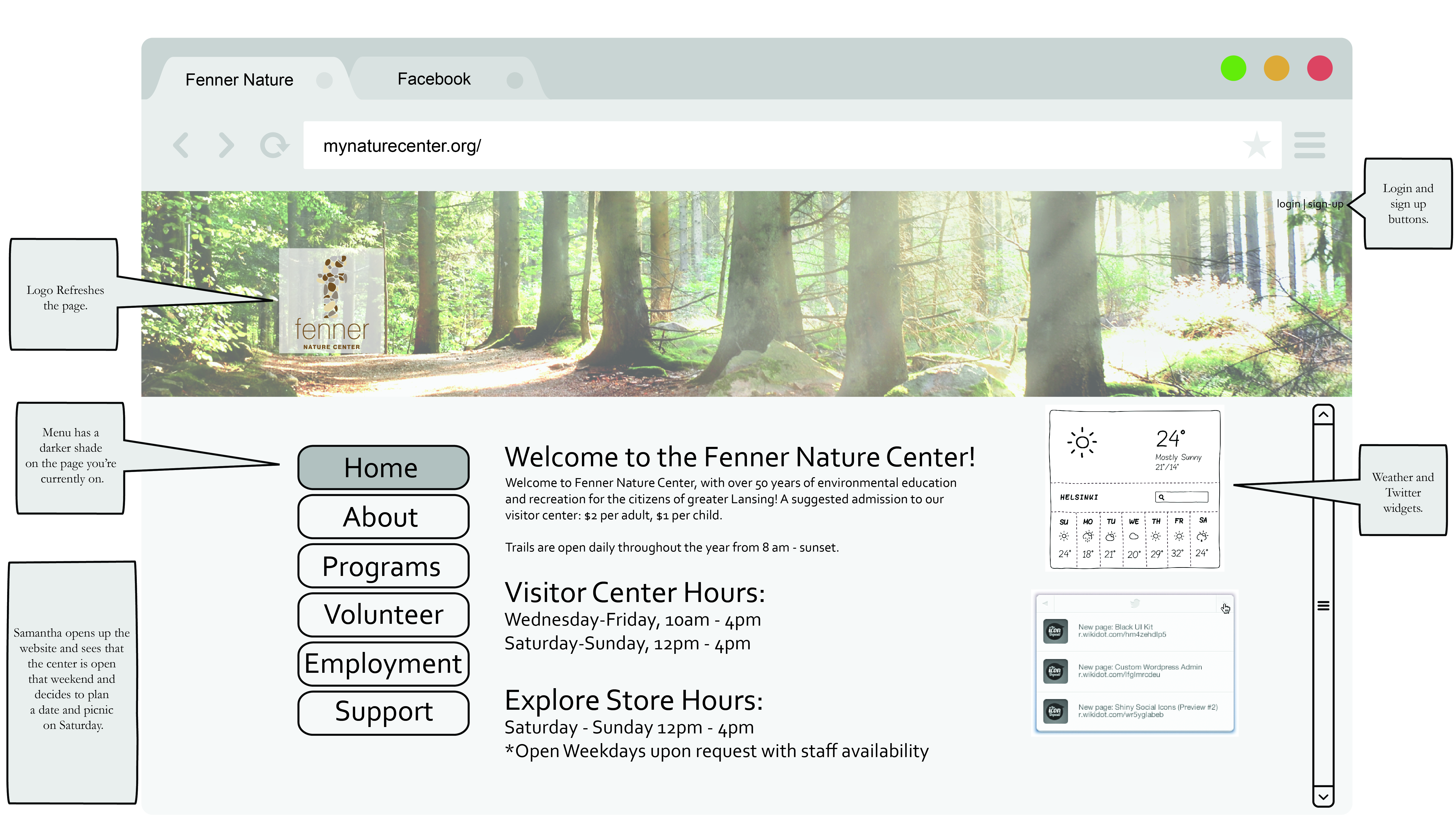
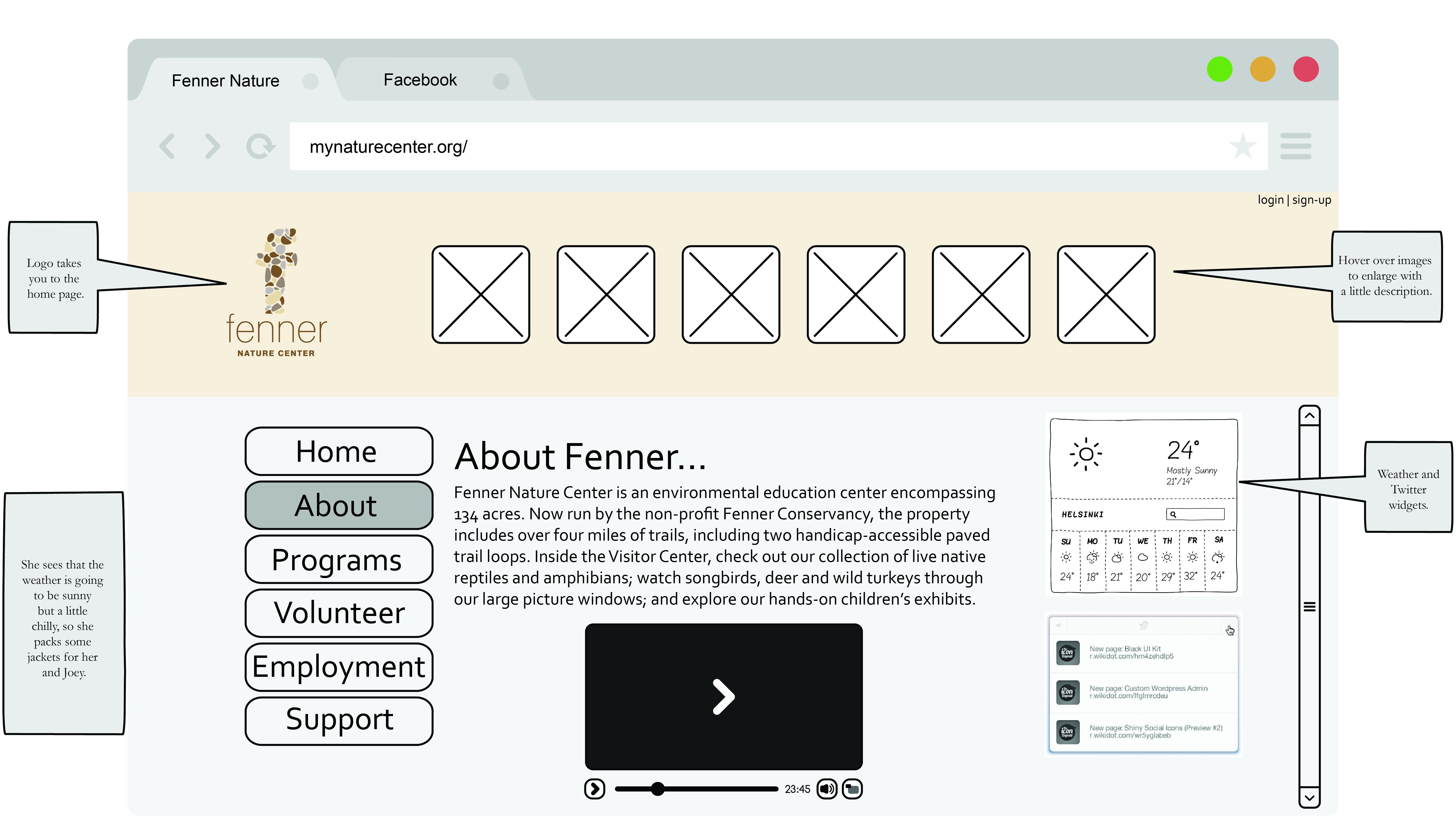
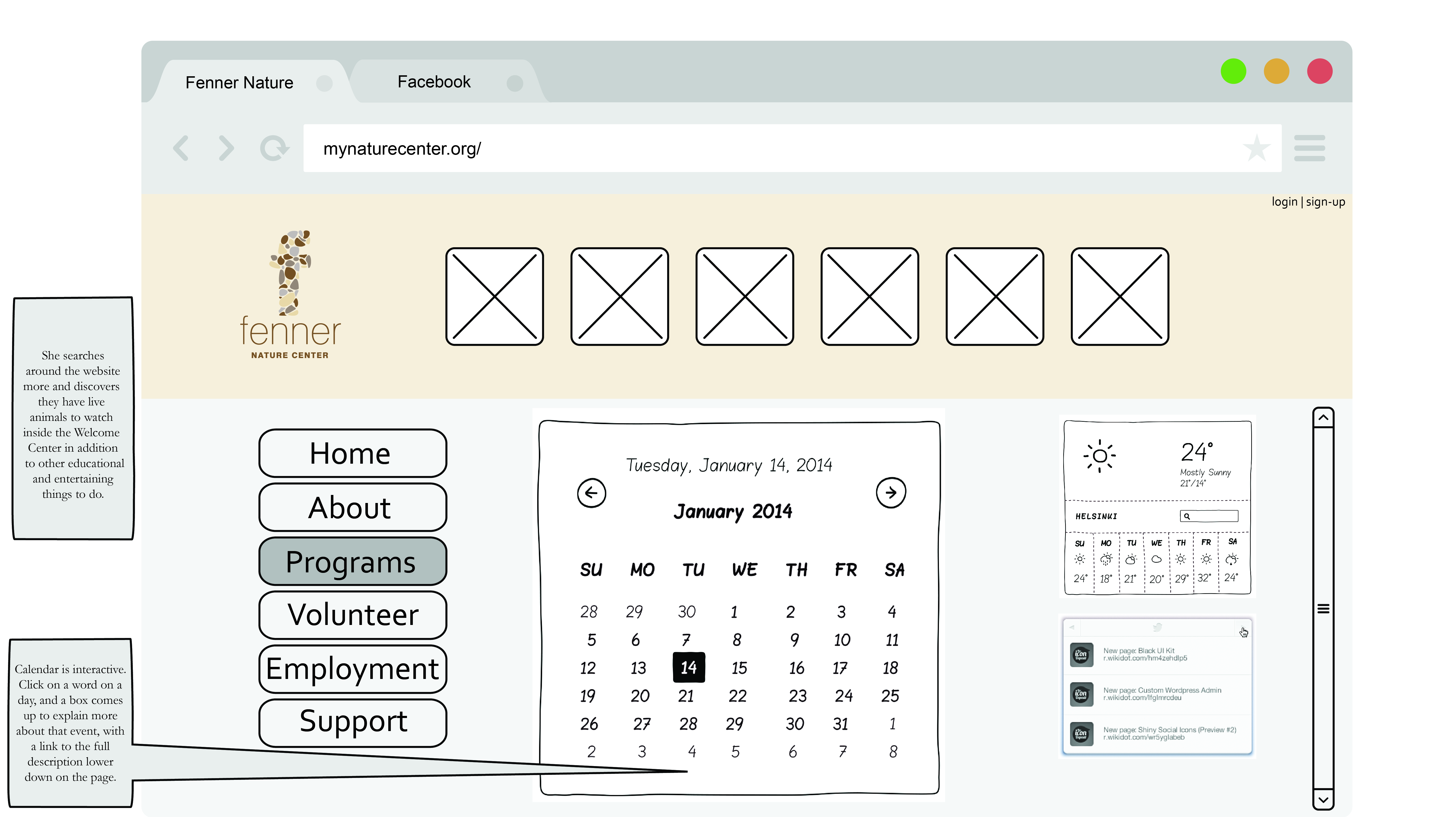
The Final Design
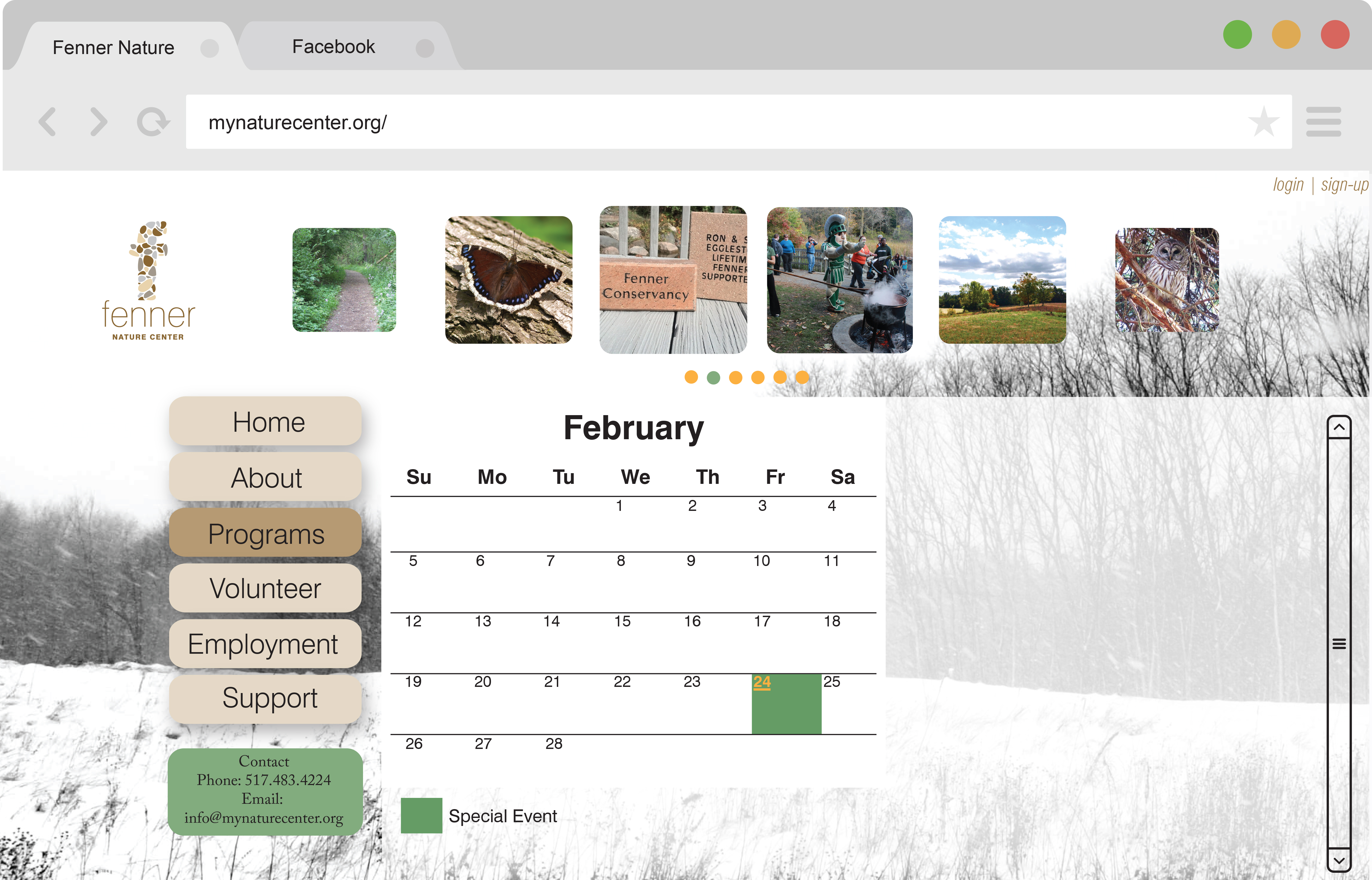
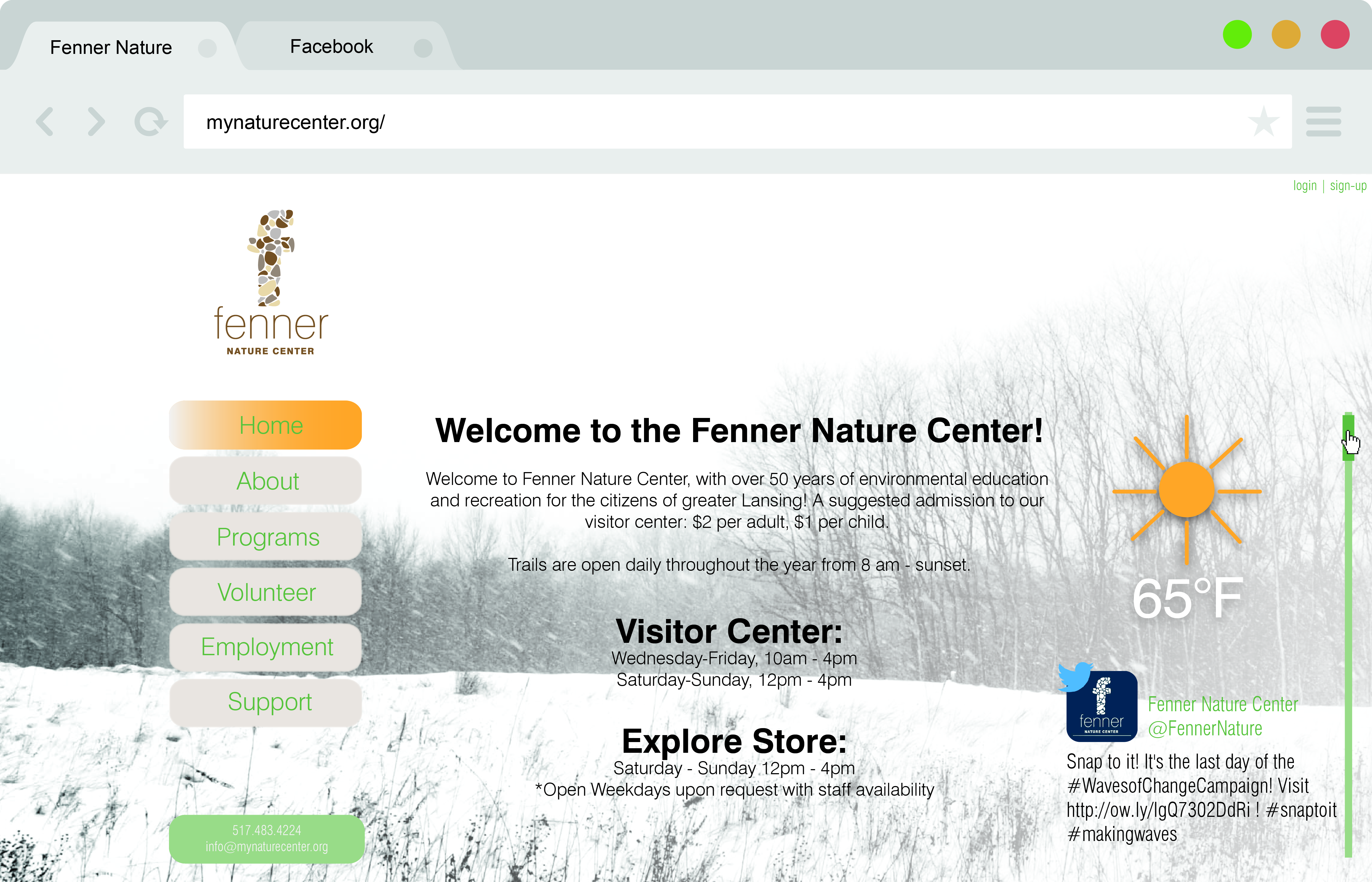
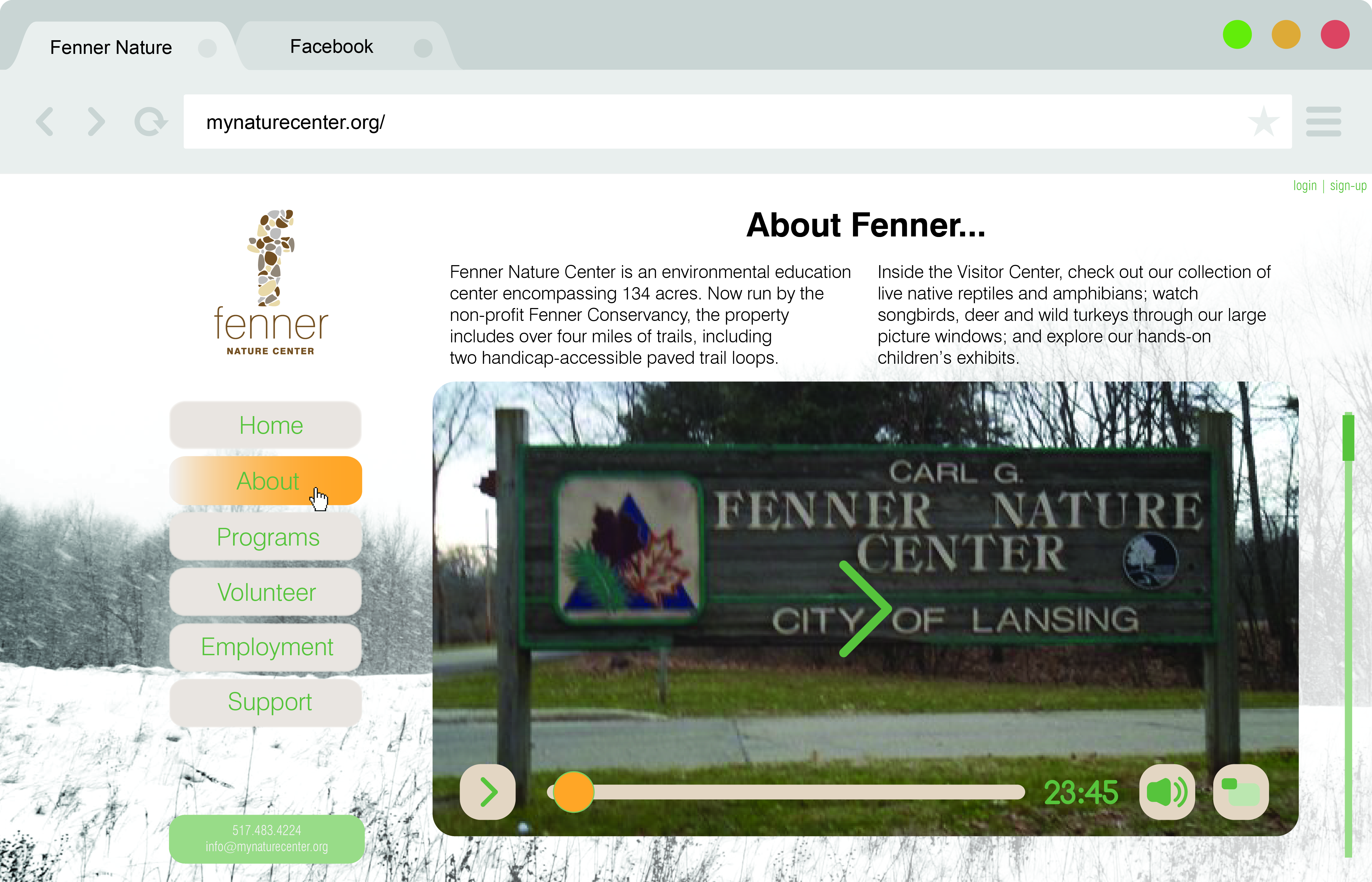
The Fenner website went through many iterations of it before it came to this conclusion, with many features and a very organized design. The Twitter and weather tickers provide quick information to users on the homepage, and the video and calendars on the "About" and "Programs" page give more specific information to those interested. The calendar is the most interactive element, with clickable dates that pop up with more information, as well as color coded events that quickly tell the user what is happening on what date.
Samantha and her son were able to find out that Fenner is a family friendly park that has events fun for all ages during the weekends. She was also able to find out how the weather will be on that day without having to click away from the site. The original Fenner website was so hard to navigate, that it was impossible to find out anything. Now it's much more clear, concise, and visually appealing.